Your projects and presentations can reach a new level of creativity with Fonts Alphabet alphabet printable sheets.
You can explore various styles, from elegant to quirky, to find the perfect match for your needs.
These printables can help you visualize how different fonts look in physical form, assist in teaching or learning typography, and serve as a handy reference when designing. They are especially beneficial for crafting personalized greeting cards, posters, or educational materials, allowing you to make your work stand out with minimal effort.

 Printable Letter Stencils Font

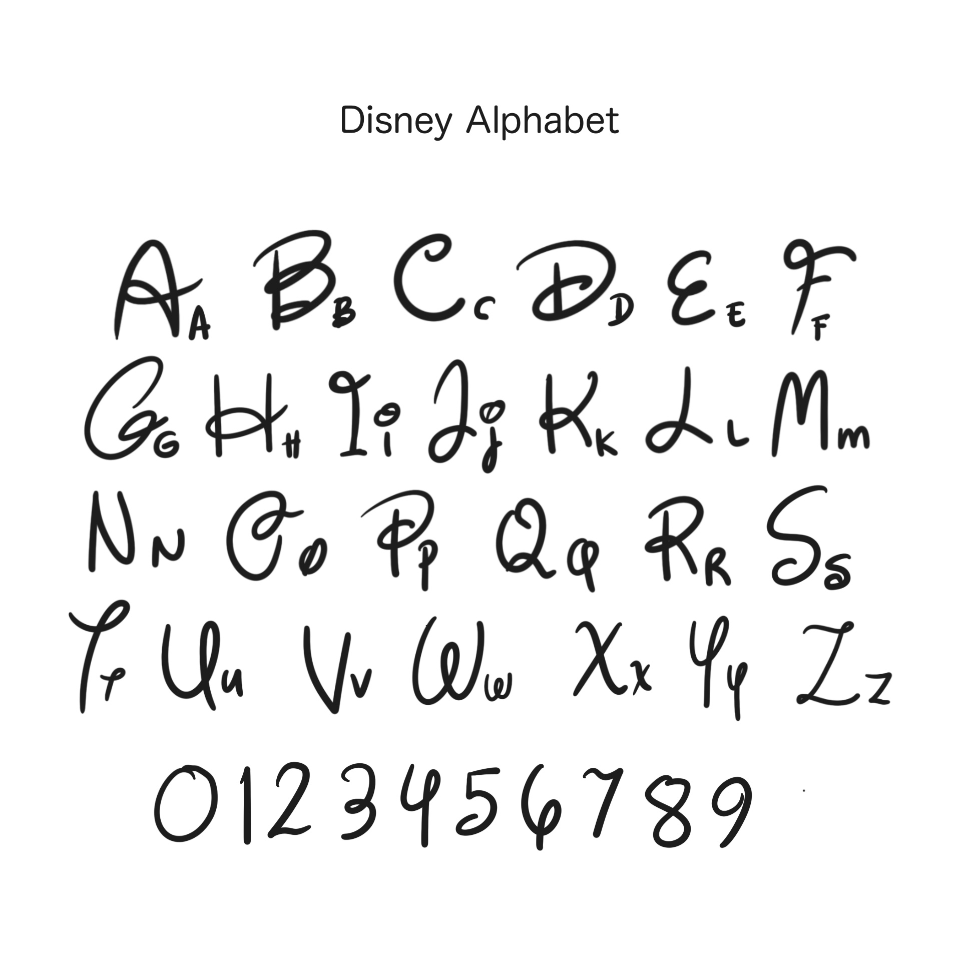
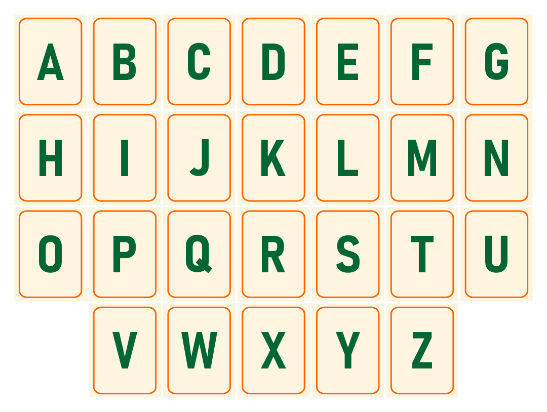
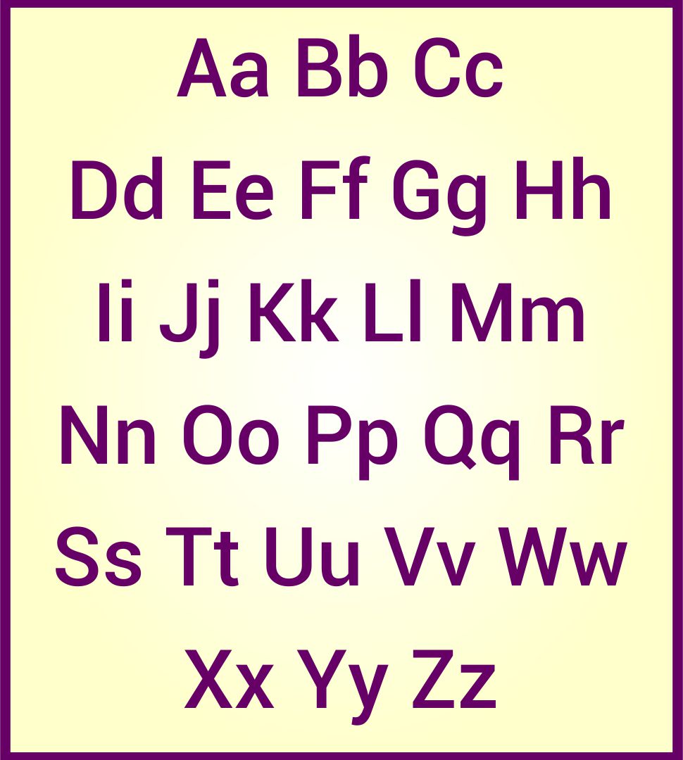
 Printable Alphabet Letter Fonts

 Printable Alphabet Letter Fonts

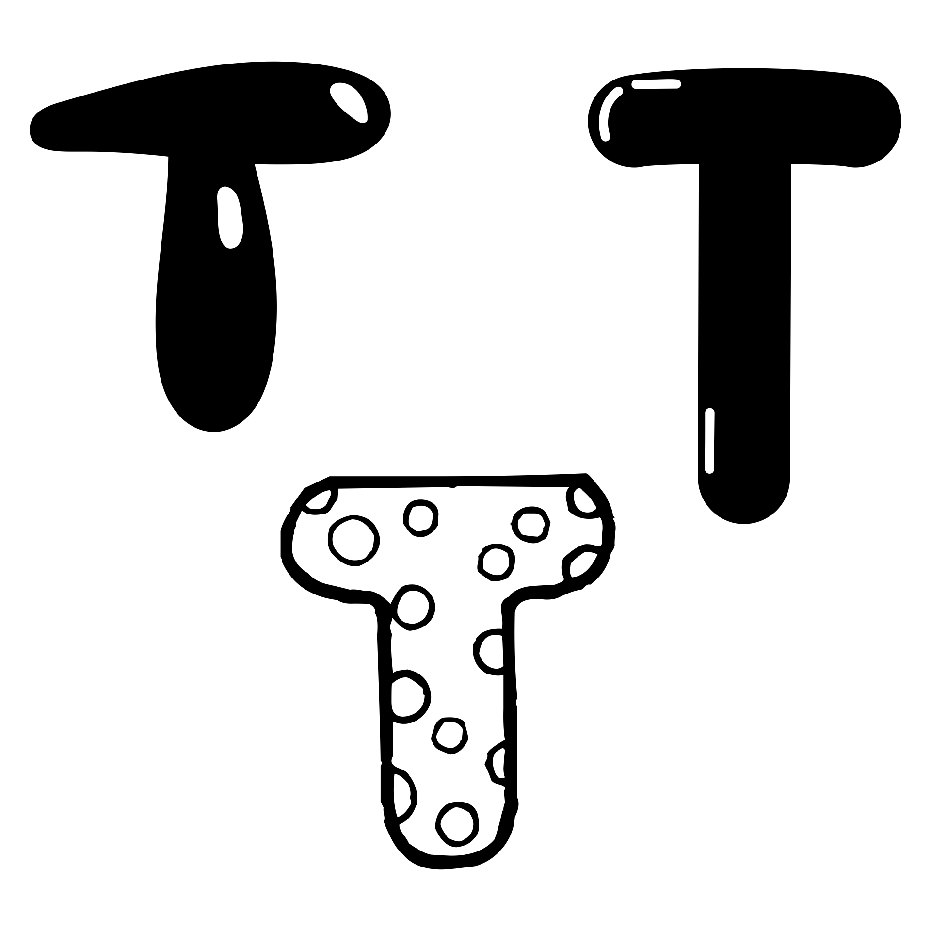
 3D Graffiti Alphabet Fonts

 Old English Tattoo Letters Font

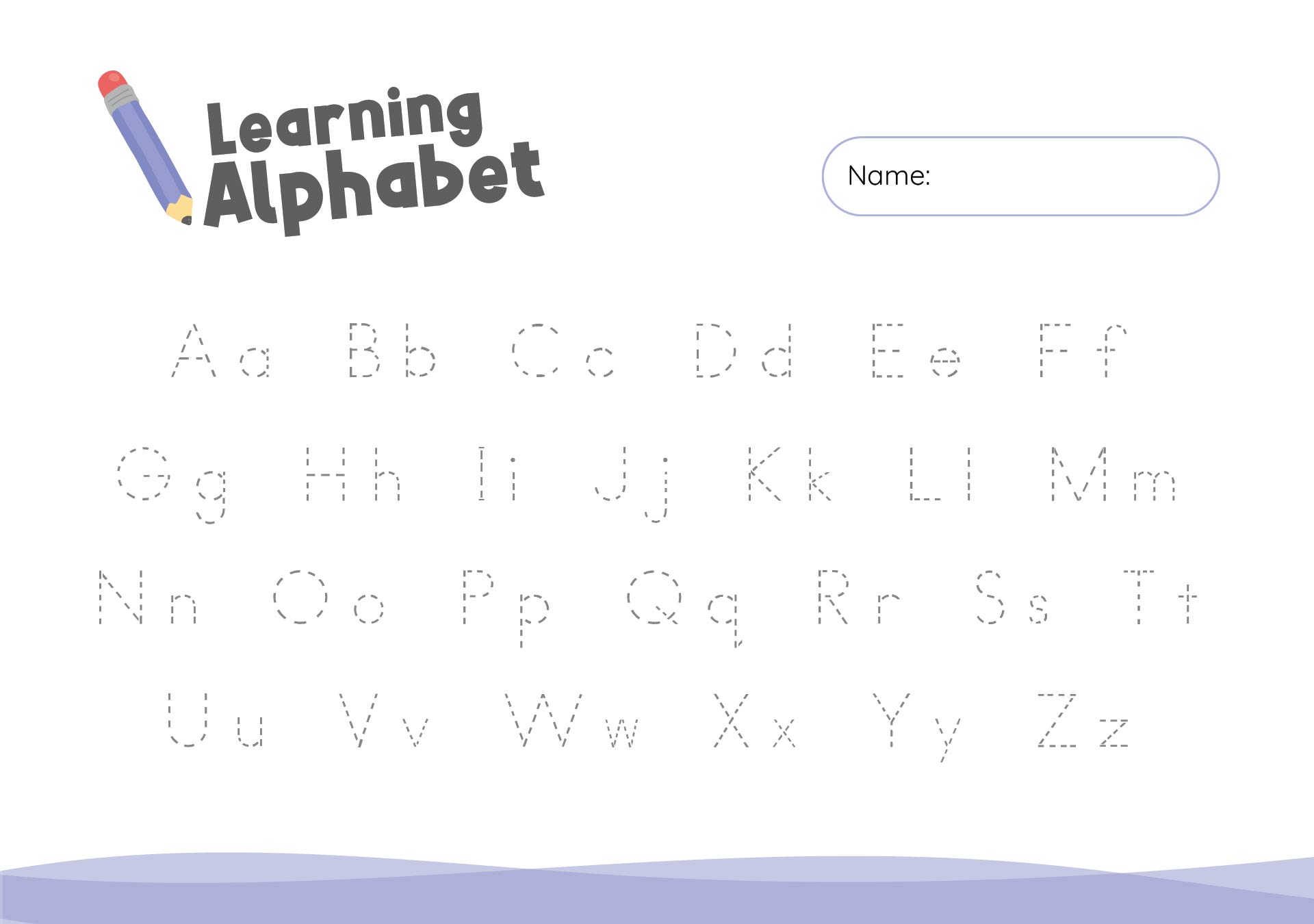
 Printable Large Alphabet Letter Templates

 Printable Calligraphy Alphabet Fonts

 Cool Font Graffiti Alphabet Letters

 Printable Bubble Letters Alphabet

 Printable Alphabet Koster Font Template Pattern
Exploring cool font graffiti alphabet letters can inspire your artistic projects or add a unique flair to your designs. You can use these styles to create standout posters, eye-catching logos, or personalize your gear, giving everything you do a touch of urban creativity. Plus, mastering graffiti fonts can sharpen your typography skills, making your work stand out in a vibrant and dynamic way.
Printable large alphabet letter templates are ideal for educational activities, craft projects, or decorating classrooms and children's rooms. They make learning letters fun and accessible, especially for young children. You can also use these templates for creating signs, banners, or custom decorations that add a personal touch to parties and events, making your celebrations more memorable.
Choosing an Old English tattoo letters font can give your tattoo a classic, time-honored look. This font style adds a touch of elegance and gravitas, making your tattoo not only a personal expression but also a piece of art that pays homage to historical aesthetics. It works well for quotes, initials, or any text-based design you want to etch on your skin permanently, ensuring your tattoo is both meaningful and visually striking.


Have something to tell us?
Recent Comments
This Fonts Alphabet Free Printable is a fantastic resource! It's simple, clear, and provides a wide range of fonts to choose from. Thank you for making it available!
Printable images of fonts alphabet for free are incredibly convenient for various creative projects, allowing you to easily enhance your designs and crafts with stylish and professional-looking typography.
This Fonts Alphabet Free Printable is such a handy and inspiring resource for adding a touch of creativity to any project. Thank you for sharing!